Kids Rooms: Color Outside The Lines
Choosing a color scheme that will last them from tot to teen might feel like an uphill battle; how to be sweet, not saccharine, playful not cuckoo—the choices (and potential pitfalls) might feel endless. If this feels all too familiar, you’re in luck! You don't need to stand in front of the dreaded wall of paint chips. You don't need to hand your Saturday over to Pinterest. Choosing a paint color your little one will love can be easy and—dare we say it?—fun.
Color Blocking

Create geometrical shapes with horizontal lines, backsplash walls, and contrasting trim. How to get it? Use painter’s tape to create your line. Check it's level by ensuring the line is the same distance to the floor at varying points along the wall with a yardstick, measuring tape, or go digital with a level app on your phone. Press the tape firmly to the wall. Pro tip: remove the tape before the paint is completely dry for a sharper line.
Primary shades in color-blocking patterns create a sense of playful irreverence. The trick to primary colors is selecting a hue that feels intentional rather than trite. Deep, clean blue FORMENTERA and pared-back red NEGRONI offer a cheeky twist to traditional red, white, and blue. A horizontal splash of continuous color lends the room cohesion. Create “zones” within a space, defined by color.
Wrap Around


Selecting a shade that’s a twist on the traditional keeps things feeling fresh. Here is the horizontal color block again, with a wraparound playful pop of rosy mauve shade JAWBREAKER. We also love the bedside table painted in the same color as the wall behind it. Walls seem to become three-dimensional when the same paint shows up on a piece of furniture.
Pattern Play


Instead of sticking with strictly geometric shapes, embrace the organic with hand-painted patterns and accents. These perfectly imperfect stripes in TANLINES embrace geometry while maintaining a sense of energy. Use painter’s tape here for a more controlled line, or enhance the irregular line by varying stripe width.
Go Bold


An irregular half wall in DARK ARTS makes a bold statement particularly well suited for those old enough to start defining their own space. If you don’t feel comfortable freestyling the horizon line, we recommend marking it in pencil and using a smaller roller to control the feathered edge. This look is also great as a two-toned wall in complementary shades.
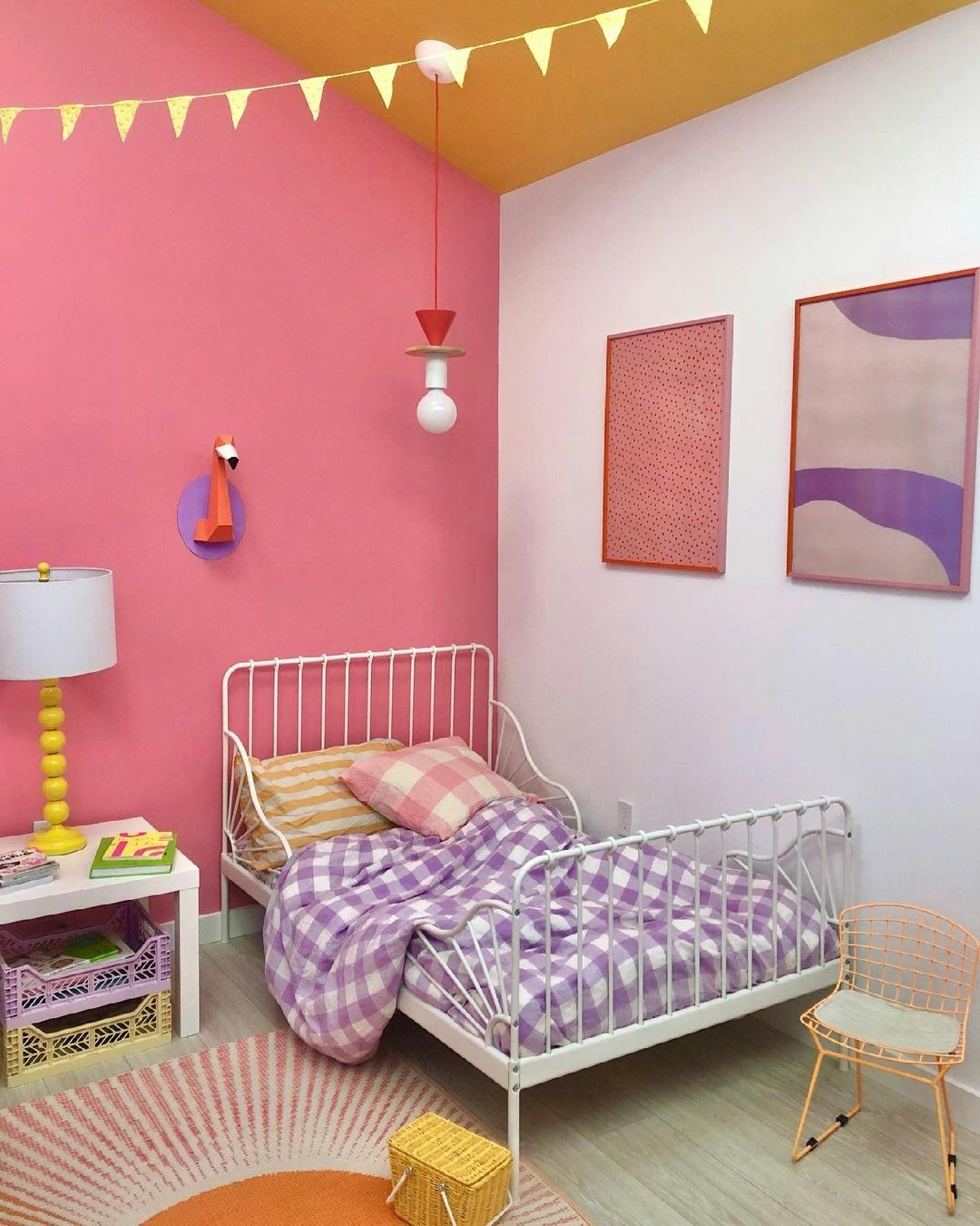
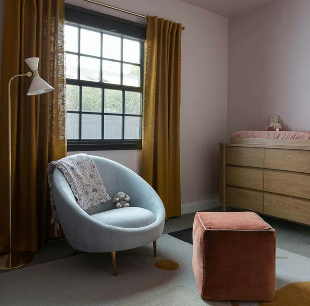
Find inspiration in an object

Looking for a color scheme? You might just find it in an object you love. Find an item you love—this can be an artwork, rug, piece of furniture or patterned fabric—whatever piques your interest. Build your palette around this item and find ways to echo the colors throughout the space. The retro lounge chair here makes a great case for a whimsical beachy palette: APERITIVO HOUR (deep, dark peach) paired with corals, lavenders, pinks, and blues that have about the same saturation are repeated in the space.
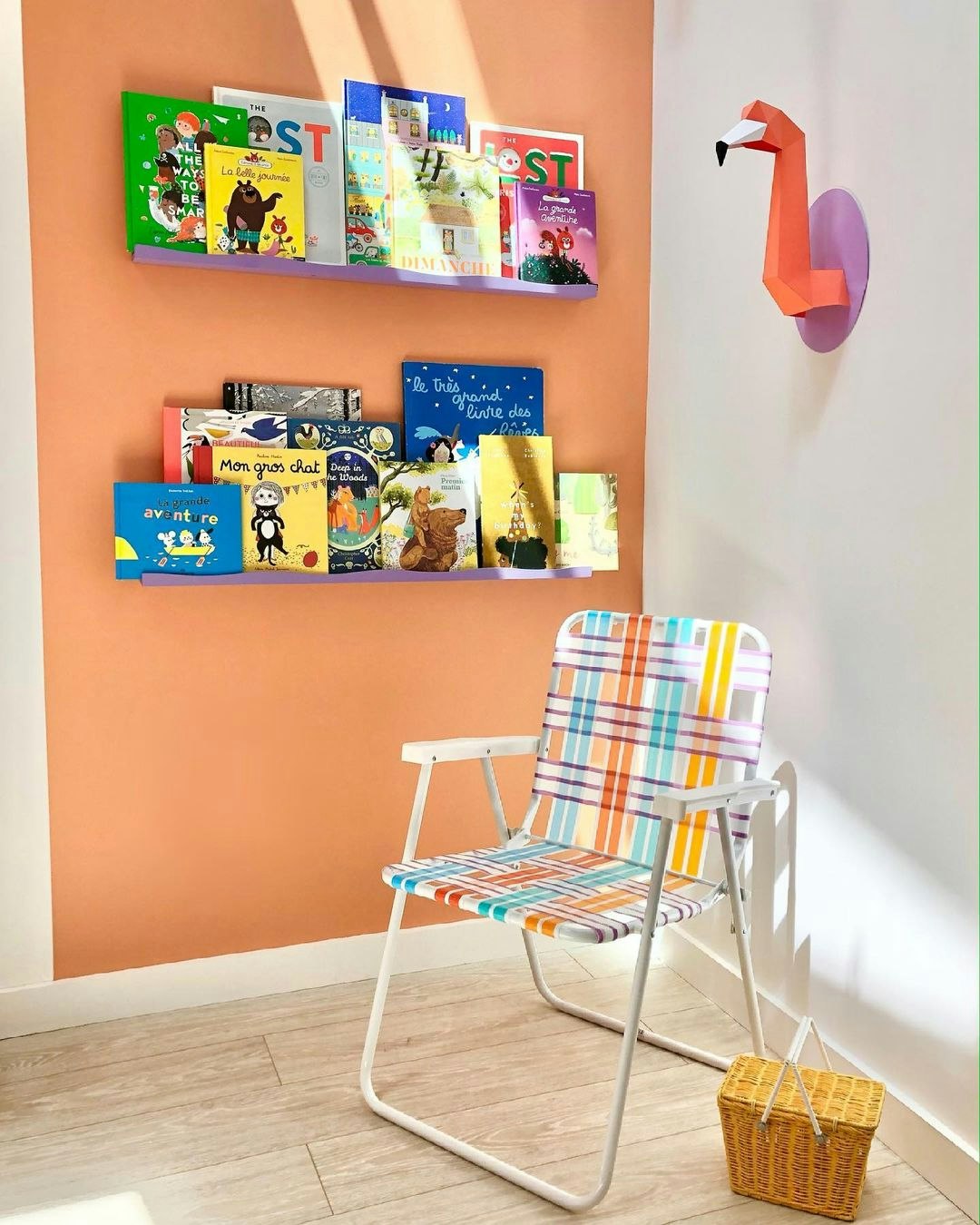
Catch some color

There are few decorating opportunities that offer more of a chance for play than a kids’ room. However choosing a complex color scheme can be nerve-wracking for the color-shy or inexperienced. Because paint is inexpensive we recommend starting with elements that are less flexible like furniture, artwork and textiles and building your palette from there. Here, the textile motif of pink, yellow, purple, and white is echoed throughout the walls and furniture.
New Neutrals
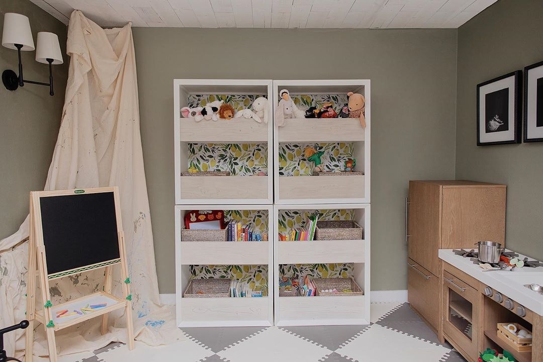
Selecting a neutral color palette is one of the simplest ways to ensure your child doesn’t outgrow their wall color as quickly as they outgrow shoes. We love a soft green, gray or beige for playrooms as it adds serenity to a space designed for activity. Muted olive green SAGED is a neutral that strikes the perfect balance between dark and light.
Muted Pinks

Pink and blue hues are decidedly nursery classics. If you’re looking to go a little more traditional, make it fresh by choosing a muted shade that will pair cohesively with your home. This neutral pink nursery is subtly rosy in the shade MODERN LOVE, a warm, muted don’t-worry-it’s-not-too-pink shade that works well in any room. Sweet for baby, but is as adaptable as your little one.
Beautiful in beige

If beige for baby seems the pinnacle of boring, we’re here to disagree. Contemporary gray-beiges promote a sense of hygge-like warmth and serenity. As a highly adaptable color scheme, they will go well in any room but are particularly useful when trying to make the most of small spaces. Paired with bare wood furniture and quiet neutrals, they are equal parts chic and harmonious. Crisp white trim on walls and furniture will make the overall effect clean and bright where beige has a tendency to go blah. A fresh coat of semi-gloss in white will revive even the most loved bedroom furniture.
Paint the fifth wall

Create a cocoon-like sense of peace and calm by painting all five walls. Using continuous color creates a sense of immersion within the color and space. Here, ROSE QUARTZ’s warm pinky-gray tones strike the perfect balance, providing a warm pop of color while still feeling neutral and lasting.
all-day sunset
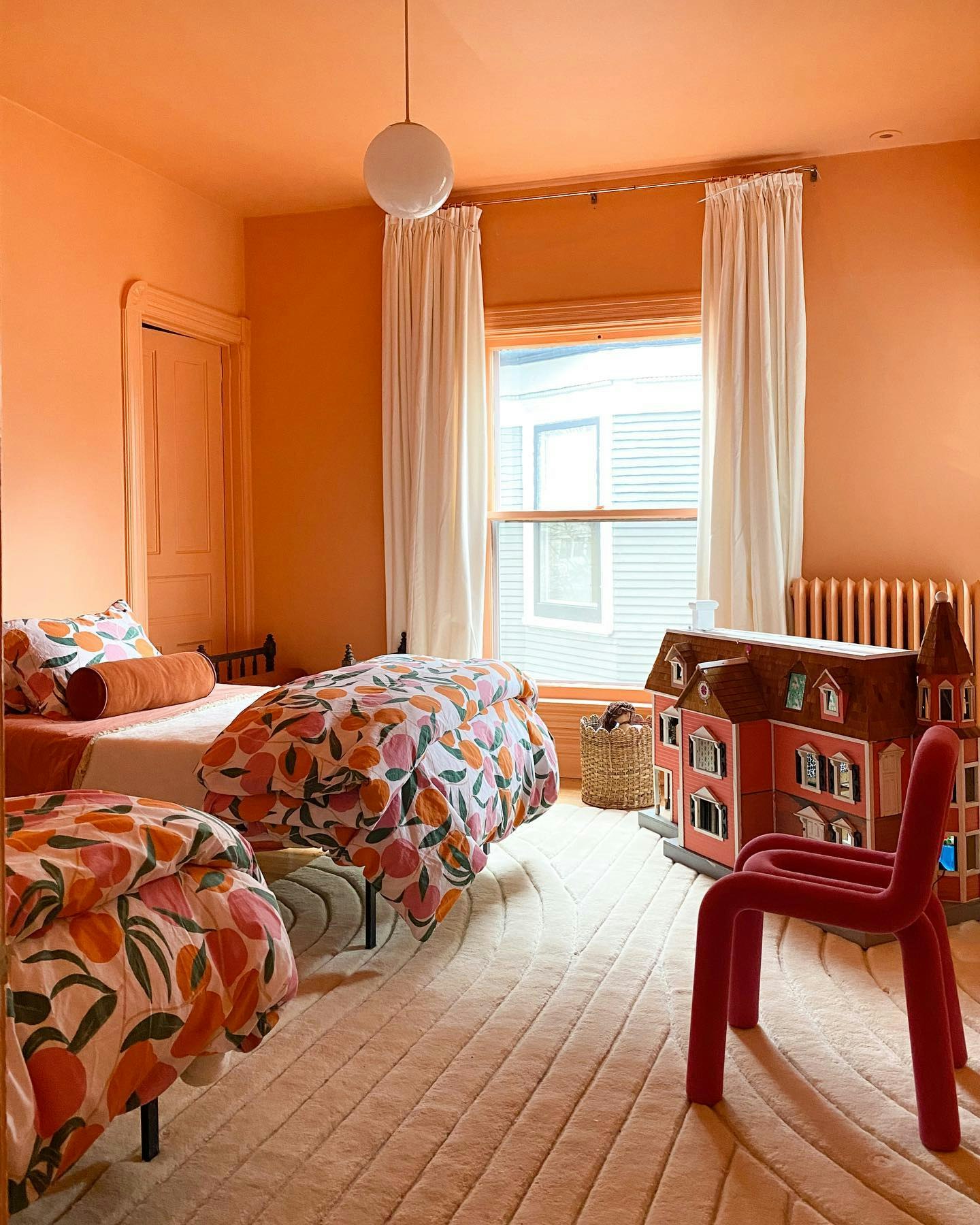
Another way to incorporate the fifth wall is to choose a deep peachy hue, evoking a sunset-like quality that will last all day. Painting all five walls will maximize that golden hour vibe. Simple, but effective.
DON'T FORGET
Go green: depending on the ingredients used and the way it’s developed, the paint itself can be really harmful to the environment. Backdrop paints are ultra low odor, low VOC, and Green Wise Certified—meeting the most stringent standards set by California’s South Coast Air Management Office. We think they’re great for every room, definitely including nurseries and children’s rooms.
Pick your finish: our Standard Finish is a great option for any room, however if you are looking for something that can take a bit more of a beating, we recommend our Semi-Gloss Finish, great for any areas that get a little more action such as kitchens and bathrooms.
Prep, prep, prep: before you apply your first coat, it’s crucial that all surfaces are inspected for cracks, holes, dents, or other imperfections. Wipe down baseboards, fill any imperfections with spackle, and tape off edges.
Paint isn’t precious!/Be generous. If your roller is saturated enough to provide an even layer of paint, you’re doing something right.